·¬ÇÑÉçÇø

Brightspot CMS Developer Guide

Swatches


Swatches provide a convenient way for site designers to select colors that conform to a site’s branding. You can configure a default swatch for all sites, and designers later customize the swatch for each site as necessary.

You configure the default swatch in the theme’s file styleguide/_colorPalette.config.json. The following snippet shows defaults for two colors in a swatch; you can define up to seven colors.

{
  "colorPalette": {
    "colorOne": {
      "type": "color",
      "displayName": "Color 1",
      "cms.ui.placeholder": "#ff1e3c"
    },
    "colorTwo": {
      "type": "color",
      "displayName": "Color 2",
      "cms.ui.placeholder": "#202020"
    }
  }
}

At run time, when a designer opens the color picker, the swatch appears along with the hue and saturation controls.
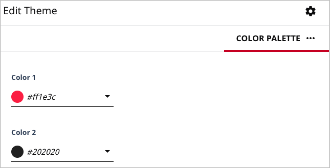
Color palette.png Color palette.png
Color palette

Previous Topic
Theme fields
Next Topic
Building a theme
Was this topic helpful?
Thanks for your feedback.
Our robust, flexible Design System provides hundreds of pre-built components you can use to build the presentation layer of your dreams.

•
•
•
Brightspot is packaged with content types that get you up and running in a matter of days, including assets, modules and landing pages.

• Content types
• Modules
• Landing pages
Everything you need to know when creating, managing, and administering content within Brightspot CMS.

• Dashboards
• Publishing
• Workflows
• Admin configurations
A guide for installing, supporting, extending, modifying and administering code on the Brightspot platform.

• Field types
• Content modeling
• Rich-text elements
• Images
A guide to configuring Brightspot's library of integrations, including pre-built options and developer-configured extensions.

• Google Analytics
• Shopify
• Apple News